Showing posts with label Framelits. Show all posts

Tuesday, 23 April 2013

Apothecary Art Artistry Card #4

Last one in this series!
And oh so simple.   I think I'll label this Clean & Simple actually!


So, a white layer on a white base - always classy.......the layer has had the edges distressed with the cutter kit.   I know some of you are a bit funny about that technique ;0 but it does highlight the tone on tone and makes a nice frame for the stamped images.

This is my favourite stamp in the Apothecary set.  You can pop up the centre like I've done here, and it looks fabulous when it's a different colour to the outside as well.

Our new butterfly punches are perfect layered together and would also be nice with a little pearl or rhinestone in the centre of the body......oops forgot to add them before I took the photo!

Stamp Set
Apothecary Art Item #127506 wood or #125527 clear
Cardstock
Whisper White #106549
Baja Breeze #116207
PearPizzazz - retired
Ink
Baja Breeze Classic #126960
Riding Hood Red Classic #126968
Pear Pizzazz - retired
Designer Series Paper
Twitterpated #125406
Accessories
Labels Collection Framelits #125598 with  Big Shot #113439
1" circle punch #119868
Elegant Butterfly punch #127526
Bitty Butterfly punch - Autumn Seasonal Catalogue #129406

So there you have it!  Four gorgeous and very different cards all using the same basic supplies.

Go get yourself some crafting done!
Cheers
Karen

Sunday, 21 April 2013

Apothecary Art Artisty Card #3

Still going with this stamp set and framelits.....don't you love that?  You can get so much use out of one bunch of supplies.  Fabulous!

This card looks so different to the previous two, primarily because the colours are so soft.  It's still the same designer series paper though, but this one is in Pear Pizzazz, one of my favourite greens, and retired.....but, a sneaky peeky reveal here....shhhh don't tell anyone......but it's making a comeback!   Shhhhhhhhhh.........

I chose to stamp this image in Pear Pizzazz because there's a lot of leaves and I didn't want to lose their fine lines by colouring them in.   I used a marker to colour the roses.


The little panel of Blushing Bride cardstock with the embossing adds an elegant touch and some extra interest.   Highlighting the sentiment panel with the pearls really makes it pop.  And there's that gorgeous bow again. 


Stamp Set
Apothecary Art (Item #127506 wood or #125527 clear)
Cardstock
Blushing Bride - retired
Whisper White #106549
Early Espresso #121686
Ink
Blushing Bride - marker retired, watch this space!
Pear Pizzazz Classic Ink - retired, but watch this space!
Early Espresso Classic Ink #126974
Designer Series Paper
Twitterpated #125406
Accessories
Labels Collection Framelits #125598 & Elegant Lines Embossing Folder #119277 with  Big Shot #113439
Whisper White Stitched Ribbon - retired
Pearl Basic Jewels #119247

Hope you are enjoying the weekend.
Cheers
Karen


Friday, 19 April 2013

Apothecary Art Artistry Card #2

I love this card!   It's so simple but has such a lot of impact with those flowers. 


This particular stamp & coordinating framelit is a good one for journaling so it could easily be added to a scrapbook layout.

Personally, I like the way it frames the flowers.

This angle shows the colours much better.  Can you believe I took the pics in natural light and the same location right after eachother?!  Bizarre

To curl the petals, I gently wrapped them round a kebab stick.  You could use pencil or a stylus just as well.  It's so tactile, I just want to touch the flowers!


Stamp Set
Apothecary Art  #127506 wood or #125527 clear
Curly Cute #121500 wood or #120510 clear
Cardstock
Whisper White #106549
Riding Hood Red #116205
Ink
Red Riding Hood – marker available in Regals set only #119701
Old Olive – marker #100079
Early Espresso Classic Ink #126974
Designer Series Paper
Twitterpated #125406
Accessories
Labels Collection Framelits #125598 & Floral Fusion Sizzlits #115969 with  Big Shot #113439
Pearl Basic Jewels #119247

Thanks for stopping by!
Karen


Wednesday, 17 April 2013

Apothecary Art Artistry

Apothecary Art is a set of 6 stamps that coordinates with the Framelits, Labels Collection.


If you haven't used stamps with framelits yet, you're in for a treat.  Stamp first, then line up the framelit and cut out the image with the Big Shot. 


Tip:  Because framelits are narrow and move easily, once you've lined them up over your stamped image hold them in place with a Post-It note.   They are thin enough to not affect the cutting sandwich of the Big Shot and the glue is repositionable so it won't damage your project.

Here's a card I made using these products.


The flowers were coloured with markers.  I popped up the sentiment using Dimensionals.  And how gorgeous is that bow?  Thats the beauty of our 1cm wide Taffeta Ribbon, it ties so nicely!


Stamp Set
Apothecary Art (Item #127506 wood or #125527 clear)
Cardstock
Early Espresso #121686 & Whisper White #106549
Did you know these also come in an assorted pack? 20 sheets of A4, 2 each of 10 colours for only $11.95 Item #121699.
Ink
Red Riding Hood – marker available in Regals set only #119701
Old Olive – marker #100079
Early Espresso Classic Ink #126974
Designer Series Paper
Twitterpated #125406
Accessories
Labels Collection Framelits #125598 with  Big Shot #113439
1cm Taffeta Ribbon in Riding Hood Red 122988
Pearl Basic Jewels #119247

To see more cards using these supplies, pop back throughout the week.
Cheers
Karen


Wednesday, 10 April 2013

Colour Challenge

I made these cards for a colour challenge - Raspberry Ripple, Daffodil Delight & Bashful Blue.

These are definitely not colours I'd choose to put together!  However, they are very bright and cheery and a good playful colour scheme - they would be lovely as a little girls birthday card, or party invitations.

Supplies Used:
Stamp Set - Papillon Potpourri & Perfect Punches
Inks - Raspberry Ripple, Daffodil Delight & Bashful Blue
Cardstock - Whisper White, Daffodil Delight
Ribbon - long since retired
Wide Oval Punch & Framelits - Labels Collection


This card was even quicker to make than the last!   I cut the cardstock to 21 x 10.5cm to get the small square size.   And I stamped the butterflies several times without re-inking to get the different tones.

Stamp Set - Papillon Potpourri, En Francais & Kindness Matters
Inks - Raspberry Ripple, Daffodil Delight & Bashful Blue
Cardstock - Raspberry Ripple, Whisper White & Bashful Blue
Elegant Butterfly & Bitty Butterfly Punch
Framelits - Labels Collection

So, my challenge to you today, is to go make a card with these colours - or choose 3 colours that you wouldn't normally put together and see what you come up with!

Cheerio!
Karen

Wednesday, 27 February 2013

SUO Challenge #65

The theme for this challenge is "Going Green".   With St. Patrick's day in March and the spring time approaching in the northern hemisphere, it's a good challenge. (SUO blog HQ is in the U.S.)

Of course for us Aussies, we're really going autumn!  But I don't mind flip-flopping my challenges as long as I'm making something.


This was a great card for using up scraps.  Yay me!   And it may also pass for a male card.  I almost stuck a wasabi dahlia on, but caught myself in time and switched it for a button.  Yay me again!!

Supplies: 
Stamps:  Make a Cake #126742 & Fabulous Phrases #120501
Cardstock: Very Vanilla
Ink:  Old Olive
Paper: Assorted DSP - yes, they're all Stampin' Up! Some are retired though :(
Tools: Big Shot & Hearts a Flutter Framelits & Bitty Banners Framelits
Accessories: Lucky Limeade Bakers Twine & Soft Subtles button in Certainly Celery.

Have a super Wednesday!
Cheers
Karen

Monday, 18 February 2013

I'm Back!

I've been so busy with Stamp University that I've neglected my blog!

So I thought I'd post some of the projects that were on display last Saturday at the event.  If you came along, thank you!  I hope you found it informative and fun, as well as a useful craft resource that you'll be able to re-visit over and over again.   Part 2 is coming so hang on to your hats! 

This sample uses the Stamp-a-ma-jig to get perfect positioning of the banner stamps & hearts (from Hearts a Flutter, #129252 clear).  And I couldn't do without the coordinating Framelits to cut out the stamped images (#130159). The DSP is More Amore Specialty #129309.  So pretty! 

What do you think of my curly dangly hearts?   They're easy to make with the small heart punch and a thin strip of cardstock that you curl round a toothpick.  

And just a reminder that you can bundle the stamps & framelits for a discount, item # 131097, which saves you around $12.

Happy Monday
Cheers
Karen

Wednesday, 6 February 2013

Mojo Monday 279

I almost made a male card.......until the flower that is!   


I like the simplicity of this card though.  And yes, I could've added a masculine embellishment - our wood buttons for example!  Doh!  But those lacy soft flowers from the current mini are so gorgeous I added it almost without noticing!

Supplies:
Stamp Set:  Fabulous Phrases
Cardstock:  Very Vanilla, Early Espresson & Midnight Muse
DSP: Comfort Cafe
Big Shot & Bitty Banners Framelits.
Scallop oval punch & large scallop oval punch.
Vanilla Flower Trim - just trim one flower off the length & adhere with a dimensional.

Have a super day!
Cheers
Karen

Wednesday, 16 January 2013

Insomniacs Team January 2013 Challenge

I made this card for a team challenge.  It uses products from the upcoming mini catalogue and Sale-a-bration   brochure.


Supplies used:
Stamps: Tiny Tags
Ink: Island Indigo
Cardstock: Whisper White, Coordinations Primrose Petals, Island Indigo & Pool Party
Framelits - Hearts a Flutter, Adorning Accents & Honeycomb embossing folders
Jewelry Tag Punch & small heart punch
Sycamore Street Ribbon & buttons from Sale-a-bration.
Rhinestone jewels.

The honeycomb embossing folder was used on the Coordination cardstock which is a special paper with a white core.  This means that when it's dry embossed you can sand it to reveal the lovely centre.  It's great for achieving depth and texture at the same time!  Love that!

Goodness, it's mid week already!   Quick, go make something!
Cheers
Karen

Tuesday, 2 October 2012

Whats on the desk?

As I was cleaning my desk, rare but true, I decided to leave the scrap bits and bobs and use them to make a project.  This can be a great way to spark your creativity especially if you've got leftovers.   Like many of you I'm sure, I have a little drawer that I stash leftover punch pieces and other stuff, but sometimes I use that drawer as an excuse to hide it all away and not feel guilty because I "threw" it away.

Anyway, here's the first project I made:


It's CAS, a style I'm growing more and more fond of.   It doesn't mean boring or lacking in technique, just uncomplicated and "not busy".  Well, that's my take on it anyway.

Supplies Used:
Stamp Set: Yummy (R)
Cardstock:  Whisper White & Coodinations Cherry Cobbler
Ink: Cherry Cobbler & Platinum Shimmer Paint
Hearts Embossing Folder & Elegant Lines, Labels Framelits
Tools:  Big Shot, Sanding Block
Accessories:  Chipboard Heart & Rhinestone jewel.

Have a lovely day!
Karen

Thursday, 20 September 2012

Mojo Monday 259

It's been a while since I did one of these. 

Here's the sketch:

And my interpretation:
 
Sorry it looks so blue with that background.  I need to work on my photography skills!   To represent the scallop detail in the sketch, I've used white taffeta ribbon and ruffled it behind the Pool Party Framelit.   Quite tricky to do!   I've only ever done this technique in a circle before and I overlooked the fact that the framelit has those bits that cut in.  Oh well, I'm still pleased with the way it turned out.  Hope you like it too.

Supplies Used:
Stamp Set;  Betsy's Blossoms
Cardstock: Whisper White, Pool Party & Pacific Point
DSP: International Bazaar
Ink:  Tangerine Tango, Lucky Limeade & Pacific Point
Framelits Labels Collection
Chevron Embossing Folder
Big Shot
Whisper White Taffeta Ribbon 5/8"
White Gel Pen


Thursday, 6 September 2012

Notecard Holder

This is a C.A.S.E. from the new catalogue.   It hold a bunch of cards and envelopes and has three coloured dividers in it with scallop circles cut in half to use as tabs.


The DSP is Summer Smooches.  It's so bright with Daffodil Delight, Rich Razzleberry & Island Indigo in it.   The flowers and letters are made using 2 retired products, but we have new gorgeous alphabet sets and the small flower from the Itty Bitty Punch pack would work just as well.  

I did some faux stitching around the edges of the DSP using a white gel pen.   And the ribbon is our gorgeous white 1/4" stitched grosgrain.

Enjoy!
Cheers
Karen

Tuesday, 10 July 2012

Same Stuff, Different Result.

Remember those scraps on the desk from yesterday?  Well there was enough to make another card as well, but although I've used a similar card sketch, it turned out quite differently.

I love the way the green (Pear Pizzazz) and the red (Riding Hood Red) from the Twitterpated DSP looks with the Basic Black stripes.   And how lovely are the shapes created with the Framelits?  The layering is just so gorgeous and you get great framing options every time.
The greeting is from Baroque Motifs (same as yesterday too!).  And the Baja Breeze strips were also leftover from last weeks classes and seemed to be just right to frame the greeting.
My dotty background was made using the Texture Plates for the Big Shot.  Not available here unfortunately, I bought them when I was living in the U.S.  
Real Red  & Whisper White are the cardstock colours again, and the scallop trim was made using the punch of the same name.

So, I hope you are inspired to go use up some scraps.
Cheers
Karen

Thursday, 31 May 2012

Twitterpated

That's exactly what I am today - smitten or twitterpated because as you read this I'll be checking in for Convention 2012 in Canberra.

Well, who knew this word meant "smitten"?  But in typical SU fashion, it does reflect the paper design.  This paper is actually our new DSP in the Autumn-Winter Mini Catalogue.  It is really pretty, and particularly the one I've used on this project.


I've continued with the Pacific Point base like yesterday - why not, it was already on the desk!  Elements of Style also make a repeat performance in the background and another of the Apothecary Art stamps forms the backdrop for the bird.   Because the stamps coordinate with the Framelits, there's no fussy cutting required making it super fast to get your accent piece on your card & Voila!

I'm having quite an affair with the pleated satin ribbon too.   It's so easy to use and adds lovely detail without the need to tie a knot or a bow. 

Supplies:
Stamp Set:  Apothecary Art, Elements of Style, It's Your Day
Cardstock:  Pacific Point, Lucky Limeade, Whisper White
DSP: Twitterpated
Ink:  Pacific Point, Rose Red & Lucky Limeade Stampin' Write Markers
Two Step Bird Punch, Modern Label & Word Window Punch, 2 3/8" Scallop Circle Punch
Pleated Satin Ribbon in Blushing Bride

Watch this space for Convention news, coming soon!
Cheers
Karen

Wednesday, 30 May 2012

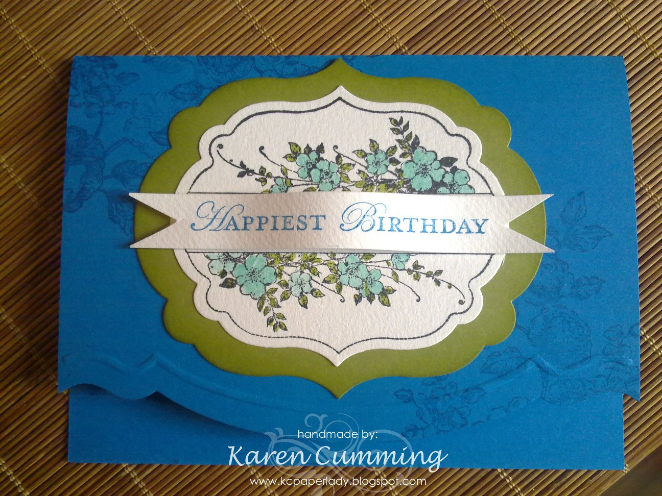
Happiest Birthday

Apothecary Art & the Framelits Dies are just two of the lovely products in the current Autumn-Winter Mini Catalogue.  I've been playing with them a bit this week and have a few cards to show you.
Here's the first one:

The flowers are coloured using our Stampin' Write markers.  I love the look of the Pool Party blue with the other colours.   I've sponged around the edge of the Lucky Limeade layer to give it some extra definition.   The largest image from Elements of Style was used to stamp on the Pacifc Point card base.


I've used the Edgelits & Adorning Accents embossing folders together on the bottom edge of the card.  This is quite tricky!   It helps if your cutting plates are new - mine aren't and they're very bent so it's a bit of a struggle to keep the Edgelit in place.  I find drafting tape works quite well because it's low tack but you still have to remove it carefully otherwise you may tear your cardstock.  I don't think it matters whether you emboss or cut first.  I've done it both ways and it doesn't seem to make much difference.   However, the embossing folder is sized for a US greeting card (5.5" x 4.25") which means it's about 8mm too short for our card width of 148mm.  Technical, I know, but it's still too damn short!   TIP: cut your cardstock to 140mm or 14cm first, then it's much easier to line up to cut & emboss.

Supplies used:
Stamps: Apothecary Art & Elements of Style
Cardstock:  Pacific Point, Lucky Limeade & Watercolour Paper
Ink:  Pacific Point, Black StazOn, Lucky Limeade Stampin' marker & Pool Party Stampin' marker
Big Shot with Framelits Dies, Edgelits & Adorning Accents embossing folders.

Happy Crafting!
Karen