Wednesday 29 June 2011

Faux Pearl

I love this technique!   I did a class on it using Rose Red and it was so pretty I decided to try it with Marina Mist.  This is a gorgeous blue and works with many styles of card.    These cards used the same supplies except that I changed the stamp set.   I originally designed them as my first attempt to get published.  Well, they didn't make the cut, but I still love them!  


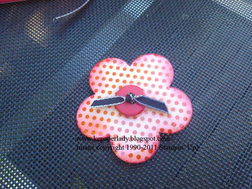
I like the contrast of Marina Mist with Basic Black.   The punched flowers are made using the Boho Blossoms punch and our pearl jewels.    The flower on the sentiment is made by punching out and layering two of the boho blossom flowers from a leftover scrap of the faux pearl cardstock.  

The faux pearl technique uses gloss card stock so if you want to stamp on it you must use StazOn otherwise the ink won't dry.   You start with your piece of gloss cardstock - mine is white.  Then you scrunch up a piece of plastic wrap and dip it into some shimmer paint that you've put onto a paper plate.  Wipe of the excess paint and then dab it onto your cardstock.  Make sure you leave some white space so that your ink colour will show up darker in some places.   Wait for the paint to dry.  Then you use a light colour ink on a brayer (Speedball is my favourite because it is softer and has a bit of "give" in it) to roller over the cardstock.   Once it's covered to your liking, polish the excess ink off with a tissue.  Then cut your cardstock however you like, stamp on it and finish your card.  Easy!


The flower stamped on this card is subtle because it's a fine line image.   But I like the way it contrasts with the solid bird.

Masculine cards are a constant challenge for me.  But I think you can adapt this technique to suit a more male card by switching the stamp set.   I've used Sense of Time here and I'm really pleased with the results:


The black brads are a great addition and the crimper is my go-to tool for turning cardstock into an embellishment when I'd normally use ribbon.   

This last card is a bit busy.  I stamped the base card tone on tone using Marina Mist ink on MM cardstock. The faux pearl is used on the clock face, the sentiment and on the strip of cardstock that goes behind them.  The pearl jewels give a royal feel to the card and I've "dirtied" it up ever so slightly by roughing up the black circle layer behind the clock face.


So, that's my take on faux pearl.   It's another great technique using shimmer paint & a brayer.  Because it's quite soft, you could use it in landscapes as a gorgeous sky or sunset.  Why not give it a try?  

Supplies Used:
First two cards:
Stamp Set:  Elements of Style
Cardstock:  Marina Mist, Basic Black, Glossy White.
Ink:  Black StazOn, Marina Mist Classic
Accessories:   SU's Shimmer Paint in Platinum, White narrow grosgrain ribbon, Marina Mist satin ribbon, Jewels - pearls.
Tools:  1" circle punch, 1 1/4" circle punch, Boho Blossoms punch, Scallop Oval punch, brayer, plastic wrap & paper plate

Last two cards:
Stamp Set:  Sense of Time
Cardstock: Marina Mist, Basic Black, Glossy White.
Ink: Black StazOn, Marina Mist
Accessories: SU's Shimmer Paint in Platinum, Black grosgrain ribbon, Jewels - pearls, black brads
Tools: 1" circle punch, crimper, 1 3/8" circle punch, brayer, plastic wrap & paper plate

Thanks for looking!   I love reading your comments, so let me know what you think.

Happy Stampin'
Karen

Wednesday 22 June 2011

Bookmark #4

Here's Susans bookmark.


It's so cute!   I love frangipani's and she's shown off the SU! Concord Crush colour and pattern to it's best advantage!

Will pop back with some project pics shortly.  Busy as always!

Karen

Friday 10 June 2011

Casing the IB&C for a gift

Ok, so this is partly a case and partly not.........the ring (Lyn Morrison) and brooch  (Michelle Martin) are both inspired by convention swaps and they made perfect gifts for my 16 year old niece.  I love the colours, although the red in the ring became decidedly pinky tinged when I used a tad too much shimmer paint!  Still, who doesn't like a bit of bling on their ring, right?!  The cute little basket that I packed them into is one I've made numerous times before.   I chose the colour scheme because of the Love Letter DSP on the brooch - so gorgeous.    I think I'll be making a ton of these in every colour so I can wear one every day! 


From an original design by Michelle Martin, http://www.ministamper.com/

From an original design by Lyn Morrison

Colours used are Real Red, Whisper White, Concord Crush & Rich Razzleberry.

The card is from the IB&C page 115.   I tweaked it a bit to suit the occasion but have retained the main elements.  The last section of the card has the scalloped envelope die, perfect for money or a gift card because 16 yr old niece's have a long list of needs that Auntie's and Uncles are not always aware of!

Hope this inspires you to get busy and re-create something you've seen and loved.

Oh, and I should add that I don't have a website or blog info for the talented Lyn Morrison.  but she's a SU  demo so you will be able to find her.

Thanks for stopping by.
Karen

Thursday 9 June 2011

Bookmark #3

Here's Liz's bookmark.  


She's used the lovely Greenhouse Garden DSP and made one of the paper flowers that we did in class a few weeks back.   Love it!

Karen

Monday 6 June 2011

Customer Challenge

During Convention, Stampin' Up! offer Memento Mall which is an opportunity for demonstrators to shop for company logo merchandise.  There are always lovely things to buy and all using SU's amazing colours and patterns.  This year was no exception with bags, stationery items, aprons, clothing......the list goes on.

I loved the magnetic bookmarks in the patterned In Color Designer Series paper designs, so I bought some to give to my customers.    I decided to throw them the challenge to decorate their bookmarks any way they liked.......lol I thought a bit of ribbon & a flower would suffice, but look what they came up with.....


Michelle made this cute little sheep with punches & that Haiku paper - gorgeous

Gloria chose the Concord Crush bookmark. Doesn't it make a lovely backdrop for this colourful butterfly laid on the scalloped oval punch shape?


Hope you like them.  I will show you some more after the next class.

Happy stamping
Karen